
Candor: Honest Design Critique
2026 · AI Product Design · Design Tooling · Personal
Conceived, designed, and shipped a live AI-powered design audit tool in one week, solo, from framework to deployed product. Candor evaluates any design across six human dimensions including emotional tone, audience resonance, and visual trust. The kind of feedback that's actually useful.
Requires your own Anthropic API Key. Don't have one, but still want to try it out? Let me know.Short demo video of the Candor app, an AI-powered design critique tool
Design critique is usually too polite to be useful, too vague to act on, or too late in the process to matter.
Candor gives you that structured second opinion before the meeting instead of after it.
↪ Impact
✓ Concept to deployed live tool in one week
✓ Built solo — framework, design system, UI, API integration, deployment
✓ Full Figma-to-code pipeline via MCP: design decisions translate directly to implementation without redrawing
✓ Enterprise interest within weeks — a ServiceNow design team requested internal access shortly after deployment
✓ Open source — public repo, anyone can self-host with their own Anthropic key
↪ The Problem
The most useful design feedback usually comes from the person who will tell you the truth.
That person is rarely available on short notice, and when they are, the session takes time to arrange, time to run, and produces output that's only as structured as the reviewer's habits or focus in the moment. Most design critique is informal, inconsistent, and heavily filtered through social dynamics. People don't say what they actually think, or if they do, it can often be non-constructive. Meetings frequently wrap up with vague encouragement.
I wanted a tool that would do what a good mentor does in a design review: look at the work honestly, evaluate it across dimensions that actually matter, and tell you specifically what's working and what isn't. No agenda, no politeness as a filter, and no calendar invite.
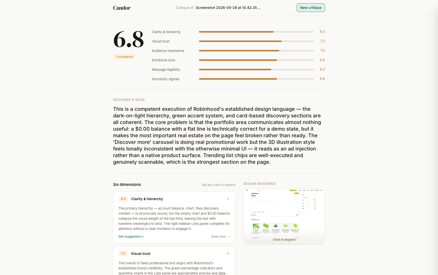
Robinhood audit — results page screenshot showing 6.8 score and Designer's Read
↪ My Approach
Framework first. Everything else followed from that.
♠︎ Framed
The six dimensions, Clarity & hierarchy, Visual trust, Audience resonance, Emotional tone, Message legibility, and Inclusivity signals, aren't what an LLM thinks good design is. They're the kinds of questions that actually come up in real design reviews run by experienced designers. Externalizing that judgment into a consistent, structured framework is the product. The AI is just the delivery mechanism.
The most distinctive addition is the dual-score intent system. When a designer specifies a Primary Design Intent, for example "should feel trustworthy and approachable for first-time investors," Candor produces two scores: an intent score (how well the design achieves its stated goal) and a universal score (the unbiased aggregate of the six dimensions). If the design scores well universally but fails its own intent, that gap gets called out explicitly. A design that doesn't achieve what it was built to do is a failure for the product team, regardless of how much "craft" it appears to embody.
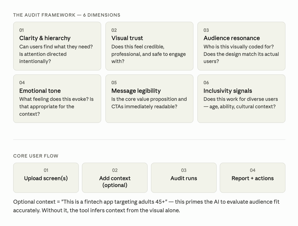
♣︎ Designed
I explored three visual directions before settling on the final approach: a dark editorial treatment, a warm studio aesthetic, and a bold typographic direction. The final design borrows the typographic confidence of the third with the warmth of the second: DM Serif Display for the score display and editorial moments, Sora for UI text. I chose the illustration because it communicates the tool's whole thesis before anyone reads a word: a human and an AI standing side by side, evaluating something together.
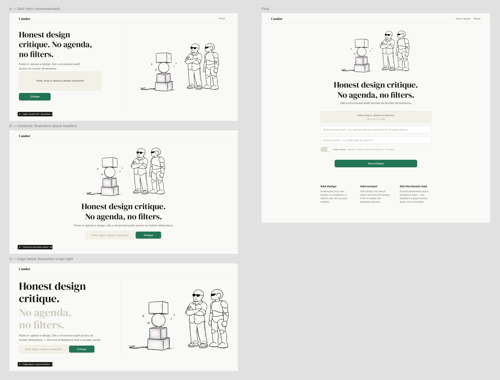
Figma — three visual direction explorations: The Critic, The Studio, The Statement♦︎ Built
The Figma-to-code and code-to-Figma pipeline ran through Claude's Figma MCP connection. Design decisions in Figma translated directly to component structure in Next.js without redrawing or re-specifying. Claude Code handled implementation, debugging, and deployment from the same session. The audit engine calls Claude's vision API with a system prompt encoding the six-dimension framework and returns structured JSON: the scores, findings, suggestions, a Designer's Read, and a point-by-point breakdown for each dimension.
The prompt engineering is where the framework actually lives in the codebase. The JSON schema enforces structure so the UI can rely on consistent output. The system prompt makes any failure to achieve primary intent the lead finding, ahead of everything else it reports.
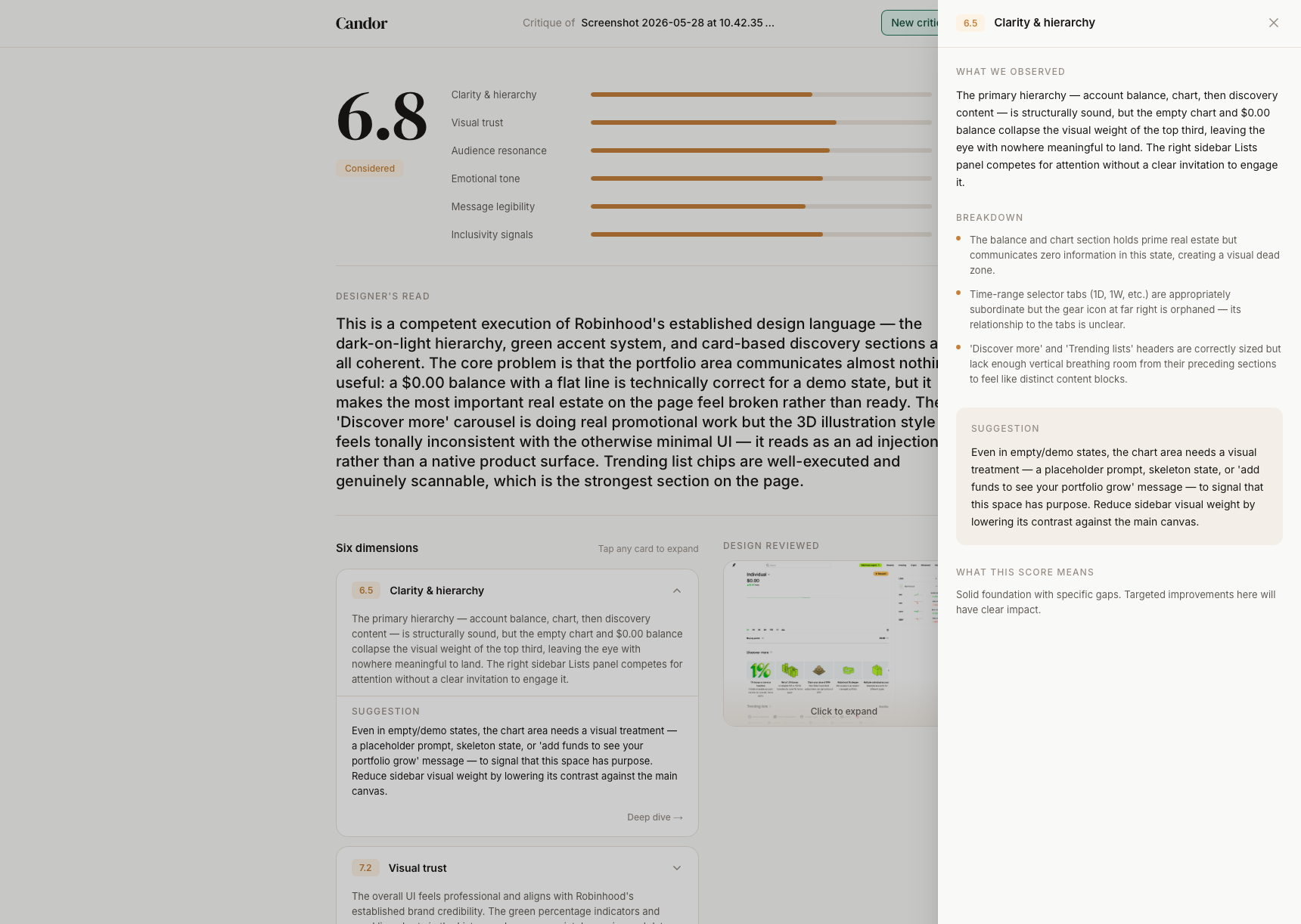
Results page with dimension cards and deep dive panel open♥︎ Shipped
Candor was deployed to Vercel via Claude prompts. I created two variants from the single repo: a private instance with password protection for portfolio demos, and a public instance where users bring their own Anthropic API key. The codebase handles both through environment variables, so there's a single code path instead of separate branches. Export formats (Markdown, plain text, PDF) make the output portable and shareable.
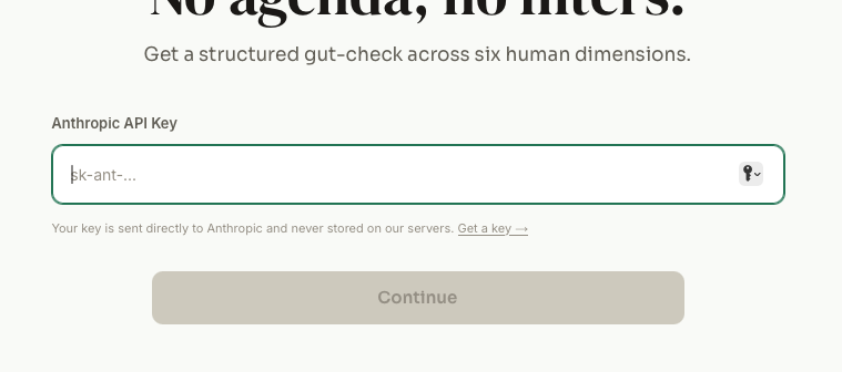
Bring your own Anthropic API Key to use public app↪ The Outcome
Design Angel on Your Shoulder
A live tool that produces specific, honest, structured critique on any design in under ten seconds. The Robinhood home screen, evaluated with the intent set to "trustworthy and approachable for first-time, everyday investors," scored 4.2 overall, well below the 6.8 it scored with a broader intent and context. The Designer's Read identified the first-time empty stock portfolio state as creating "a flat, almost deflating emotional experience right at the most important moment in the user journey," and flagged the Discover carousel as reading "as an ad injection rather than a native product surface." These are specific and verifiable reads, the kind of observation a designer can actually act on.
More practically: a demonstration that one designer, working with current AI tools, can take a product from concept to framework to deployed application in a week, and produce something with enough substance that an enterprise design team wants access to it.
Tools of the new designer: AI interlocutor (Claude Cowork), IDE (Cursor), CLI (Terminal), notepad (Scrap Paper), and drawing tool (Figma; not shown)
Same design, but using different intent and context results in different analysis, scoring, and recommendations
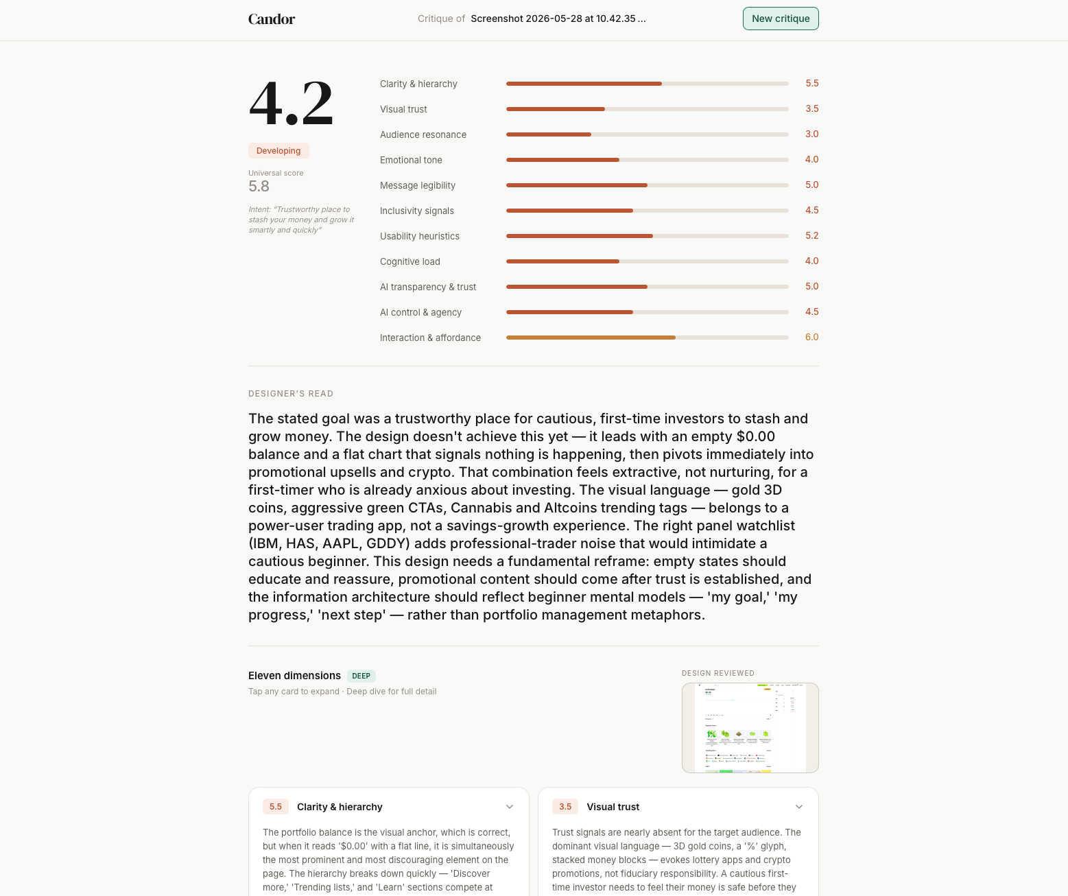
Tools of the new designer: AI interlocutor (Claude Cowork), IDE (Cursor), CLI (Terminal), notepad (Scrap Paper), and drawing tool (Figma; not shown)Same design, but using different intent and context results in different analysis, scoring, and recommendations↪ The Insight
The framework is the asset. The code is not.
Anyone with Claude access and development skills could assemble something that functions like Candor. What's harder to replicate is the specific articulation of the six dimensions, the dual-score intent system, and the decision to position honest critique itself as a product value. Those came from years of design practice and a clear point of view about where the gaps in the process actually sit.
The lesson for designers building AI-powered tools: the value comes from what you've systematized out of real experience. The tool you used to build it barely factors in. As technical barriers keep dropping, human judgment is exactly where the value grows, which is where our energy and attention should go too.
Candor is just v1. Over time, the framework will get better and the dimensions will be refined by what actual audits reveal…or don’t. That's where the real work is.
Want to talk about the framework or the gnarly details of how I built it? Reach out.