
How I redirected a failing UX toward clarity, alignment, and delivery
When a product experience starts to collapse, more design isn’t the answer—better decisions are. I stepped into a project where complexity had overtaken purpose, reset the direction, and led the team away from a doomed path toward a simplified, goal-driven experience that engineering could actually ship.
The Challenge
A visionary “invisible assistant” concept collided with enterprise reality
Touchless Expenses was designed as a concierge-like mobile experience that quietly resolved issues through nudges and confirmations—minimal, elegant, and largely unseen.
The original concept relied on:
a chatbot-style interface
custom GUI cards and illustrations
discovery through subtle prompts
The vision was strong.
The dependencies were fragile.
The First Pivot
The core interaction model was removed just before launch.
Executive leadership withdrew support for extending the design system into the proprietary chat UI, citing insufficient ROI for parallel platform evolution.
New constraints appeared immediately:
no chat-based GUI
no custom components
no system extensions
Drawing on prior experience shipping within rigid enterprise systems, I proposed a compromise:
recreate the feel of the concierge using existing components
preserve visual intent while changing interaction mechanics
favor shippability over theoretical purity
The product shipped on time—but the cracks were already forming.
Why the First Pivot Failed
Design compromises accumulated into systemic friction.
Once in users’ hands, the experience struggled because:
authentication required too many steps
the app lived inside a platform shell we didn’t control
the guided flow was hidden behind a low-priority banner
users couldn’t skip unresolved items
design system tensions increased
Early stakeholder users tolerated this context.
Real users did not.
Diagnosis
The concierge wasn’t rejected—it was never truly experienced.
Using interviews, walkthroughs, and telemetry, the pattern was clear:
users abandoned flows after notifications
most never discovered guided resolution
others bypassed it entirely
The core insight:
invisibility only works when friction is near zero
authentication resets momentum
hidden intelligence feels absent, not helpful
This wasn’t a UI problem.
It was a model problem.
The Second Pivot
Incremental fixes couldn’t save the concept; it had to evolve.
I pushed for a strategic reframing:
shift from invisible automation to visible, conversational guidance
align with emerging generative and agentic AI capabilities
build on an assistant foundation already in progress elsewhere
At the same time, I drove:
a reassessment of mobile strategy
access to native APIs for biometric authentication
removal of the biggest adoption blocker
This pivot was informed by experience—recognizing when persistence becomes sunk cost.
Reframing the Vision
The assistant needed to be seen, understood, and trusted.
The evolved direction emphasized:
transparency over invisibility
conversation over silent state changes
discoverability over subtlety
The goal didn’t change:
reduce manual effort
simplify resolution
respect user context
The execution model did.
Outcome
The product shifted from idealized minimalism to viable intelligence.
The team gained hard-earned clarity:
invisible UX has limits in enterprise environments
automation must be understandable to earn trust
stakeholder familiarity masks real usability risk
platform and authentication constraints must shape design early
The product moved forward with a stronger foundation.
What I Learned
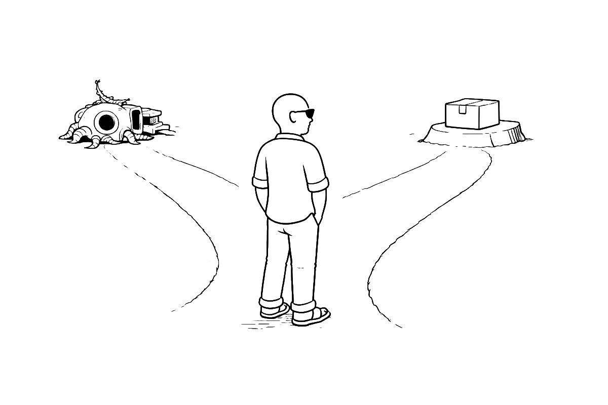
Experience matters most when the answer isn’t “iterate,” but “change course.”
Key lessons reinforced:
visibility beats invisibility when complexity is high
constraints are design inputs, not afterthoughts
timing and technology readiness shape what’s possible
Leadership here wasn’t about shipping faster.
It was about knowing when the original answer was no longer the right one.